Background:
Random House publishers has a site showcasing children’s books – RHCBooks.com. Each book is described in detail, and the site links to various options to purchase from external distributors.
The Challenge:
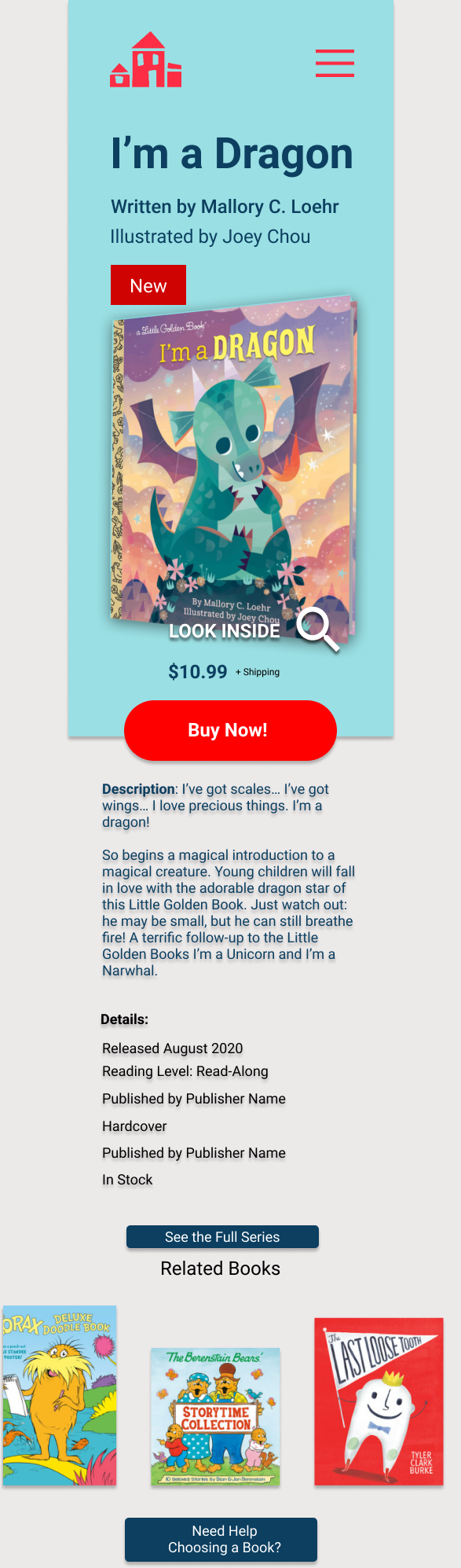
Redesign and convert their individual product pages into functional purchase pages so visitors do not need to leave the site to purchase the books.
The Process:
By first researching the children’s book industry, meeting with users, and analyzing the data, I was able to brainstorm and ideate an informed design to keep visitors on the site to move forward with their purchase.
The Result:
With the Design Thinking process I successfully produced prototypes faithful to the goals and brand of Random House, informed by the challenges of the industry, the company’s needs and the customers preferences and behavior.

Research
Competitive Research
- I browsed and took notes on various ecommerce websites, with a focus on booksellers.
- I compared various booksellers, and read articles describing the business, and challenges.
What I learned:
– There’s tough competition with digital media.
– They have difficulty attracting children and teens.
– They use some consistent UI models.

User Study
User Interviews
- I conducted interviews over the phone with 4 participants.
The plan was to have 3 participants, but I found one of them had very limited experience shopping for books online and offline, and I had to find someone else. * Lesson Learned: Make sure to screen participants beforehand to insure they are a good match.
- I chose a broad spectrum of potential children’s book shoppers: a frequent shopper, an occasional shopper, and an unlikely shopper.
- Before the interviews I prepared for myself a booklet with an outline of questions.
Empathy Mapping
I took comprehensive notes from the interviews and sorted them in empathy maps to organize and better comprehend the responses expressed by the participants.
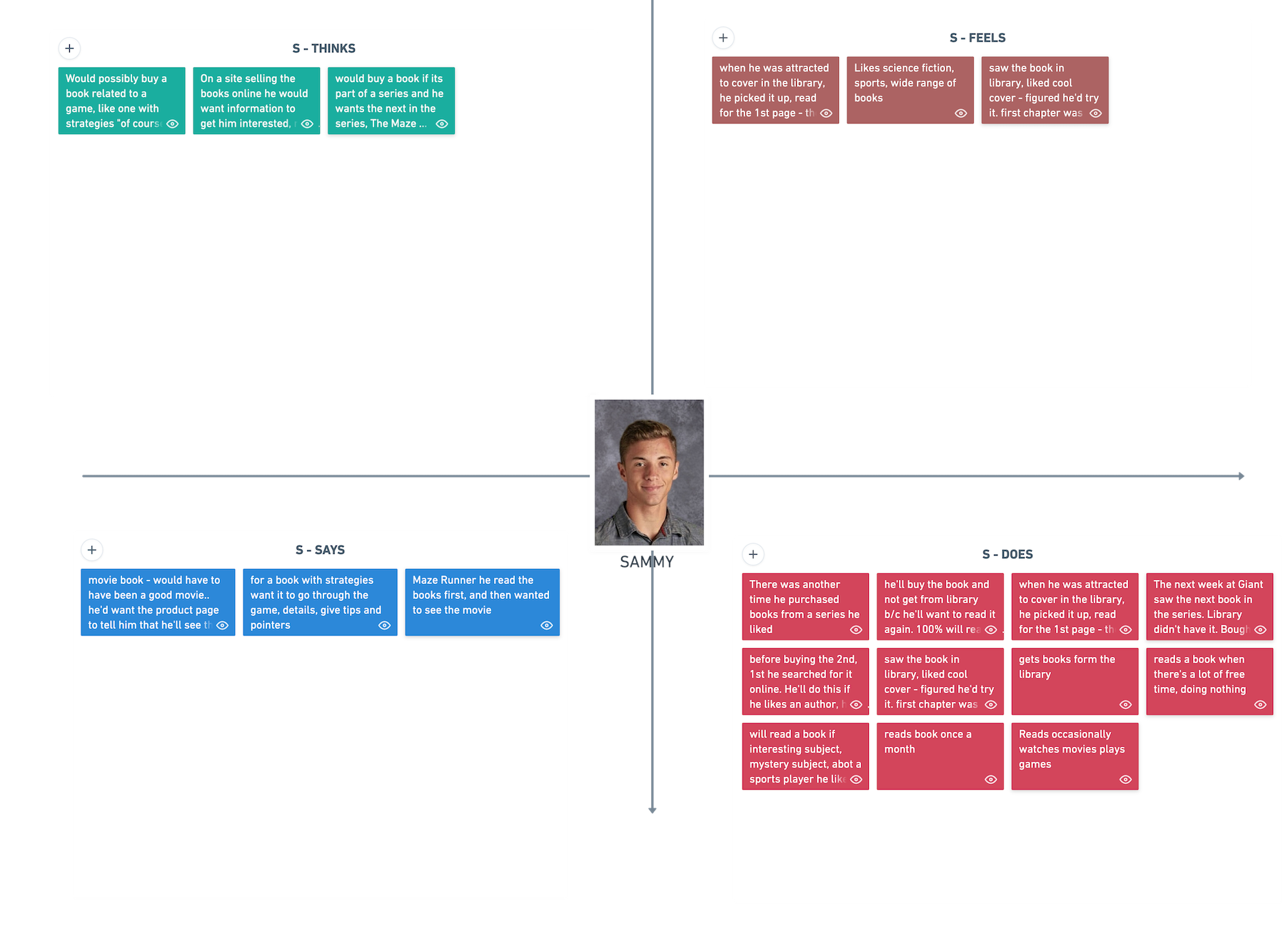
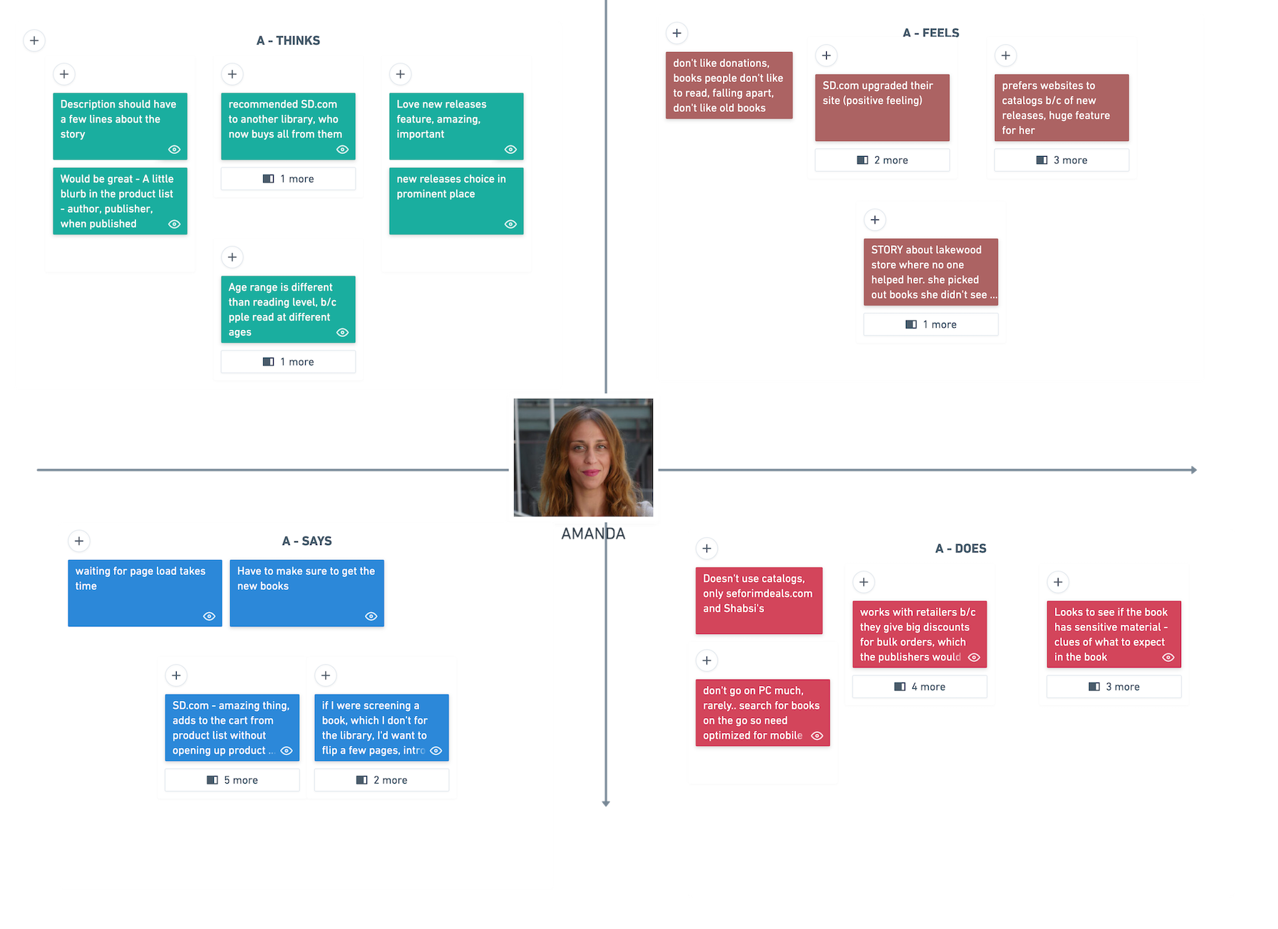
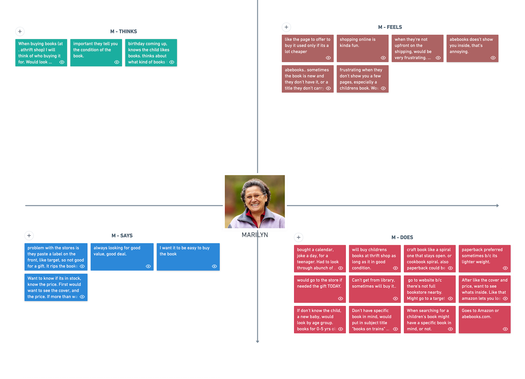
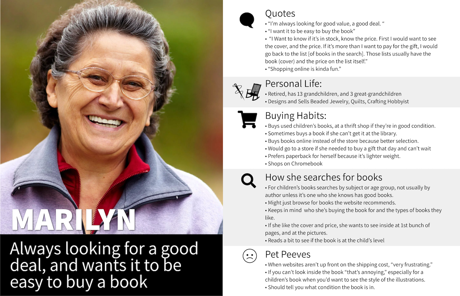
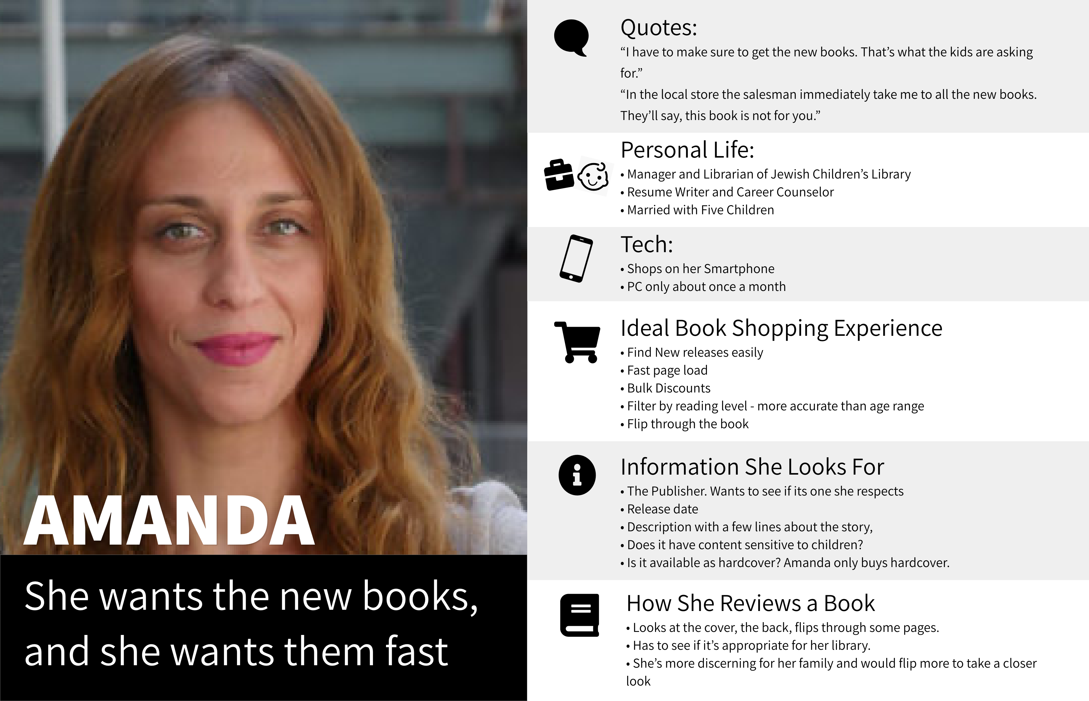
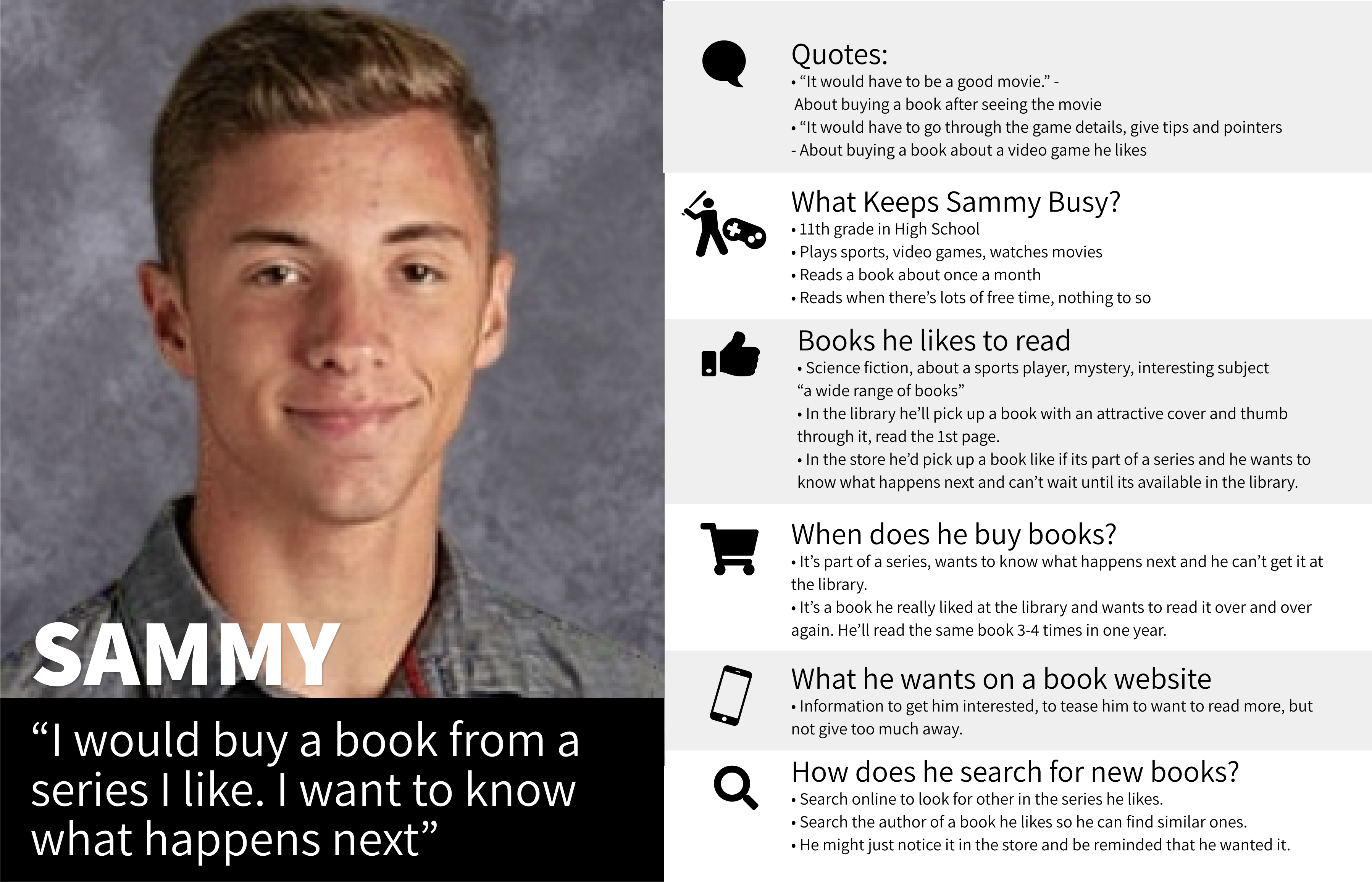
Personas
With the data from the interviews, organized with the help of the empathy mapping, I created personas presenting the spectrum of target customers to understand and empathize with the clientele.
This serves as a useful reference to continue to empathise with the potential users, and guide the design and stakeholder decisions towards the ultimate goal of the project – to serve the customer in a manner tailored to their real-life experience and behavior.
Flow Analysis
I mapped out the current flow of the website to draw awareness to the context of our product page.
I became aware of the possible steps that would proceed and follow my new design and this would help prevent conflicts with the users past and future interactions.
RHCBooks Flow")
IDEATION
Brainstorming, Sketches
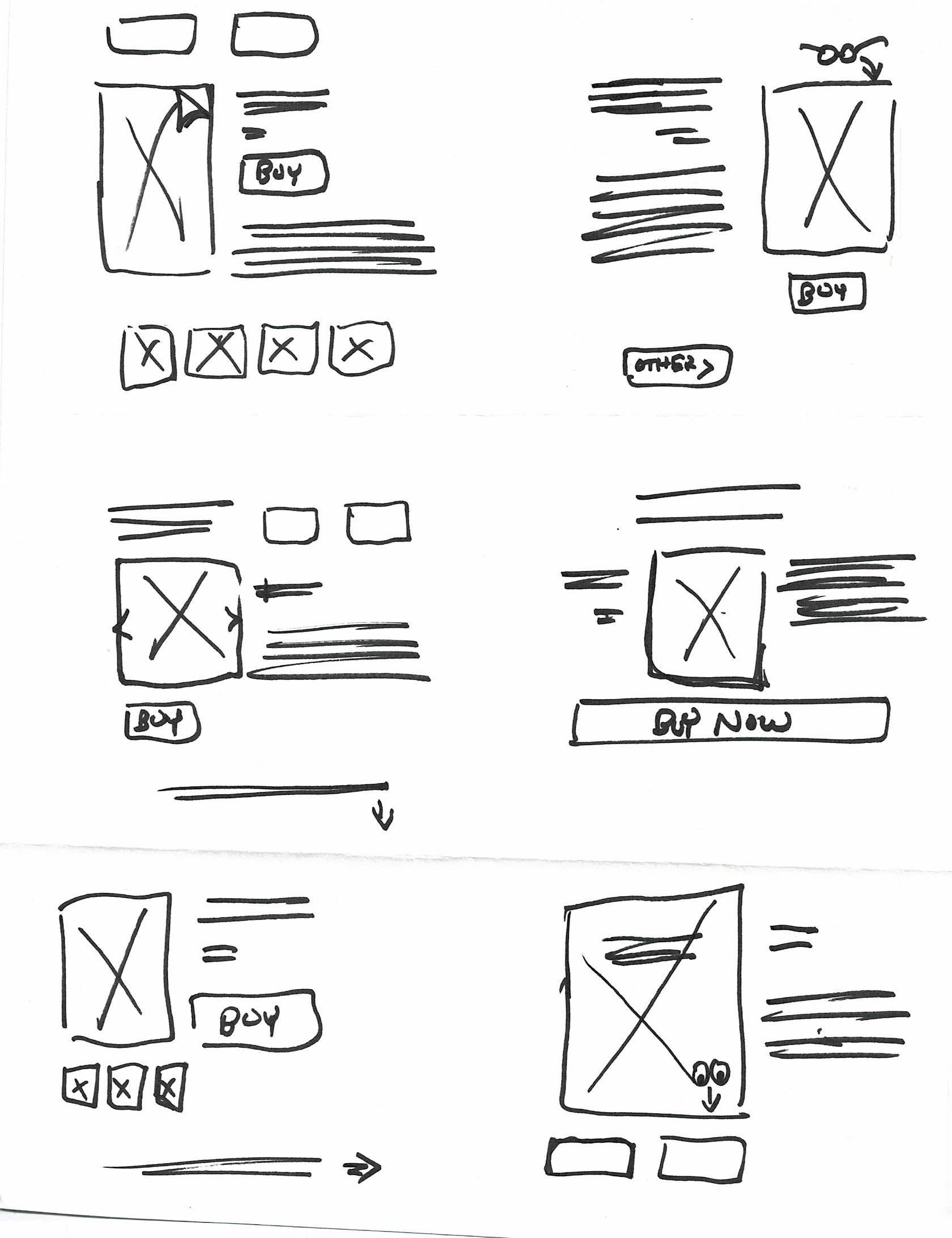
- I outlined an inventory of existing features, and new features and functionality needed to meet the needs and behavior of the users and the stakeholders.
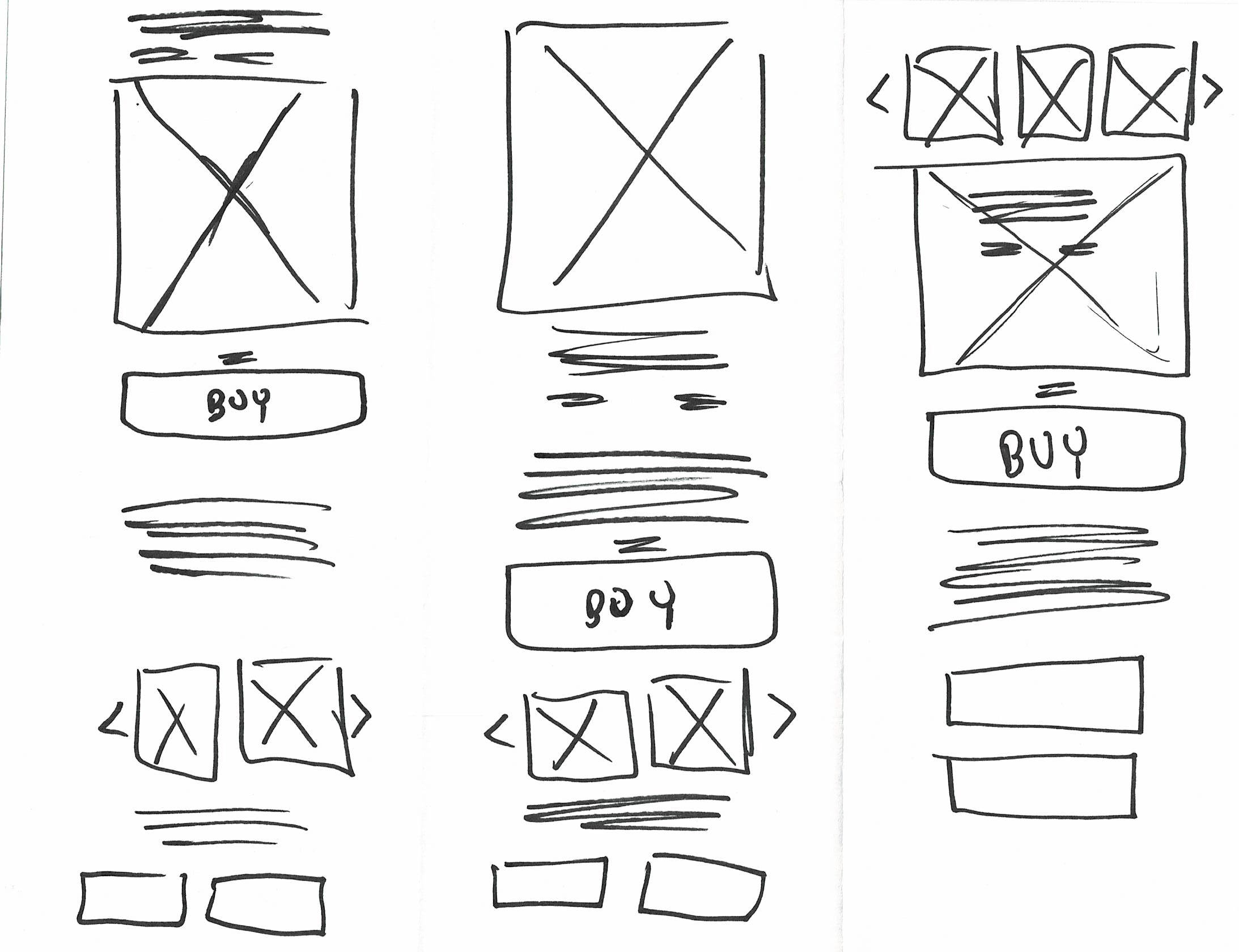
- After folding a paper into sections (similar to the “Crazy 8” exercise) I quickly sketched various layouts based on the features culled from the needs of the customers. I mixed and matched the placement of the features to explore out-of-the-box possibilities.
These exercises inspired new features and layouts that would address user needs culled from the earlier research, while ruling out other ideas that were seen as too busy, distracting, or unintuitive.
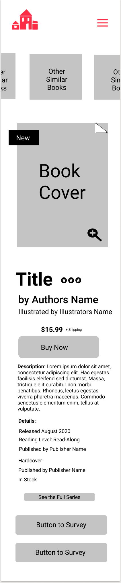
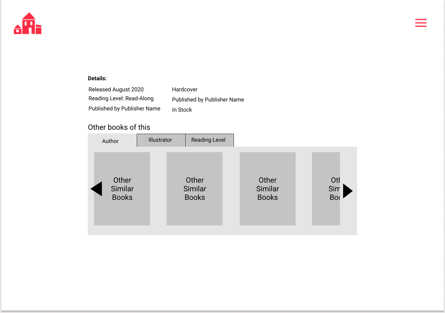
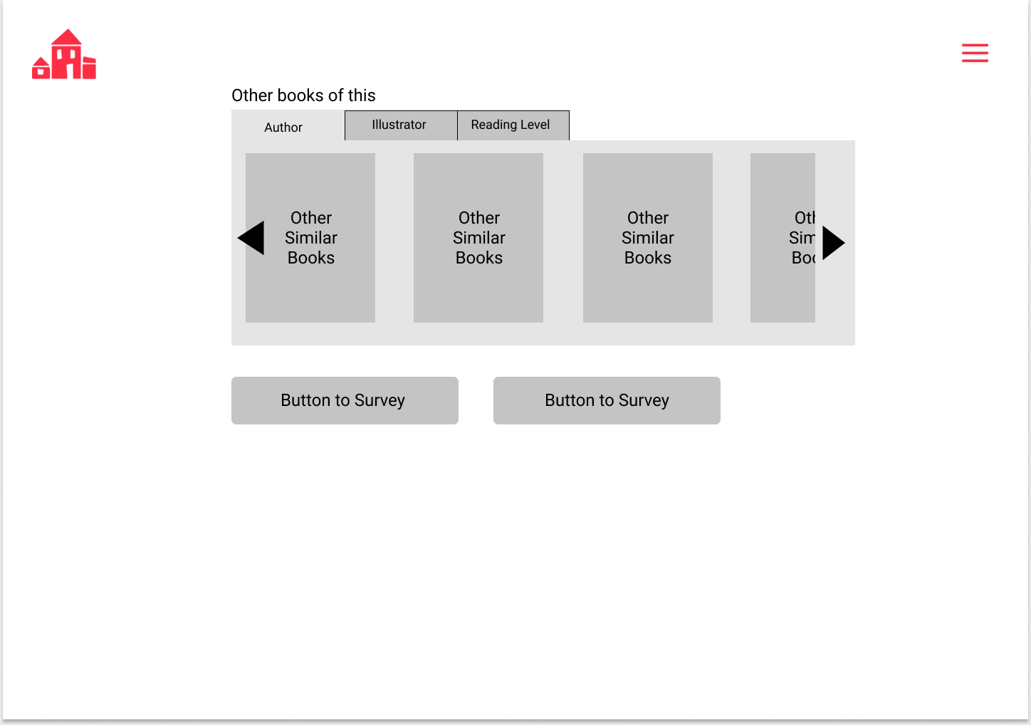
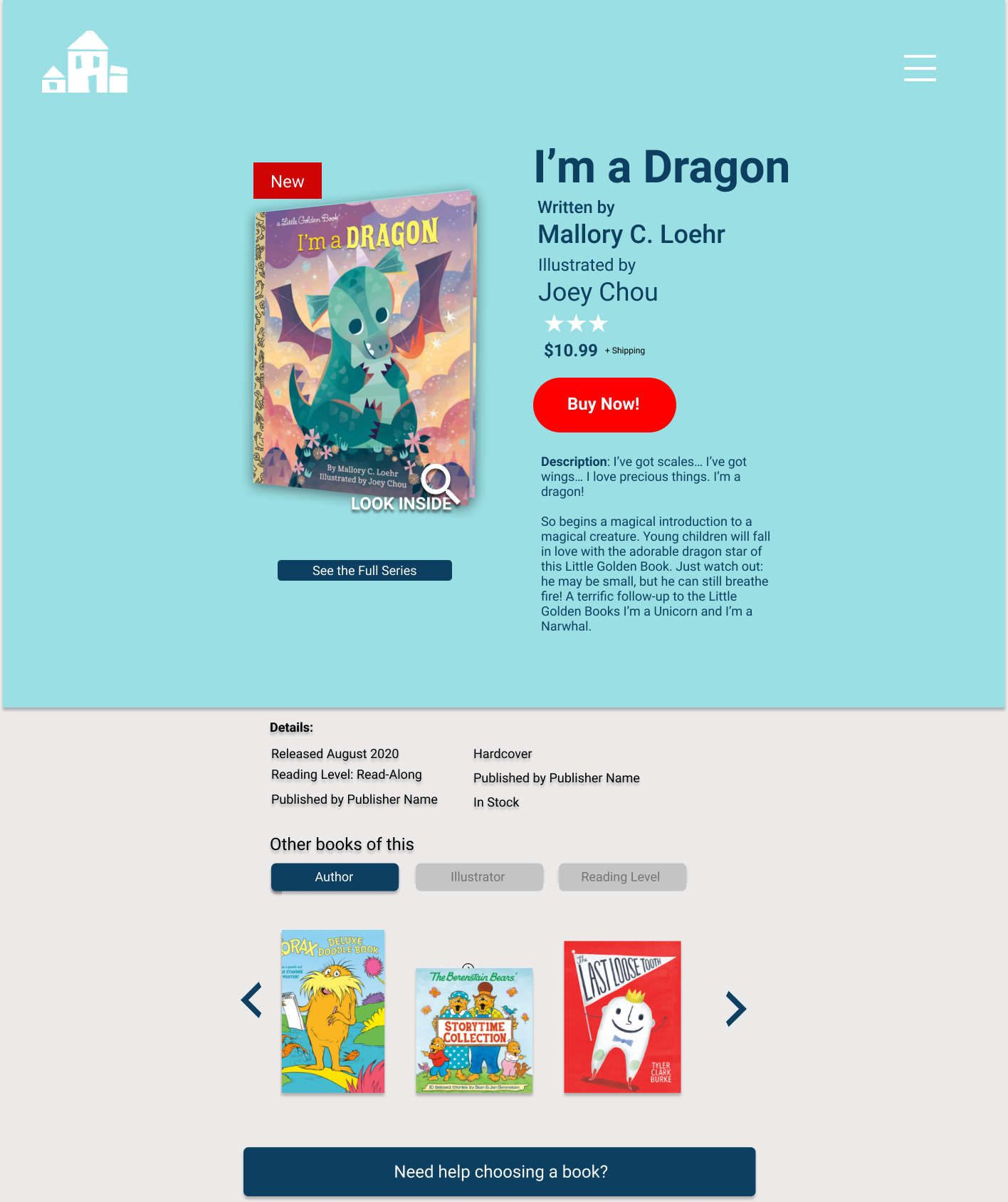
PROTOTYPES
Wireframes and Prototypes
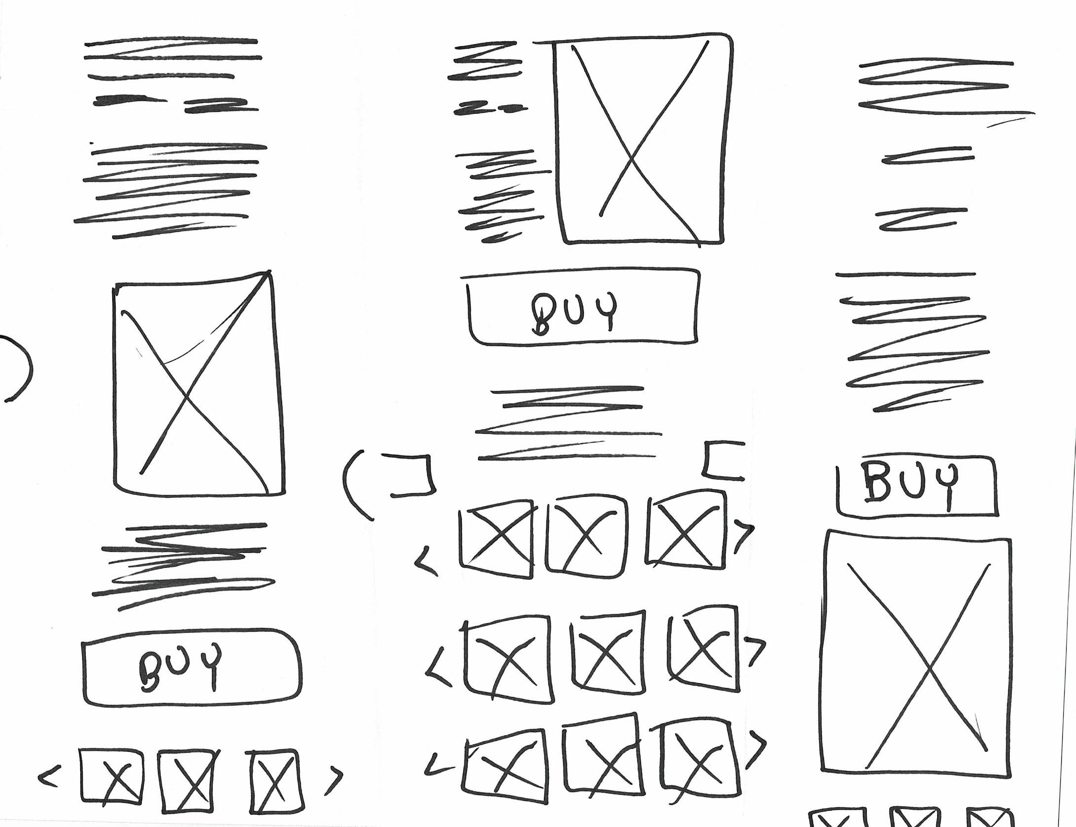
- I sketched various layouts based on the features culled from the needs of the customers.
- Further combinations of feature placement were explored in the process.
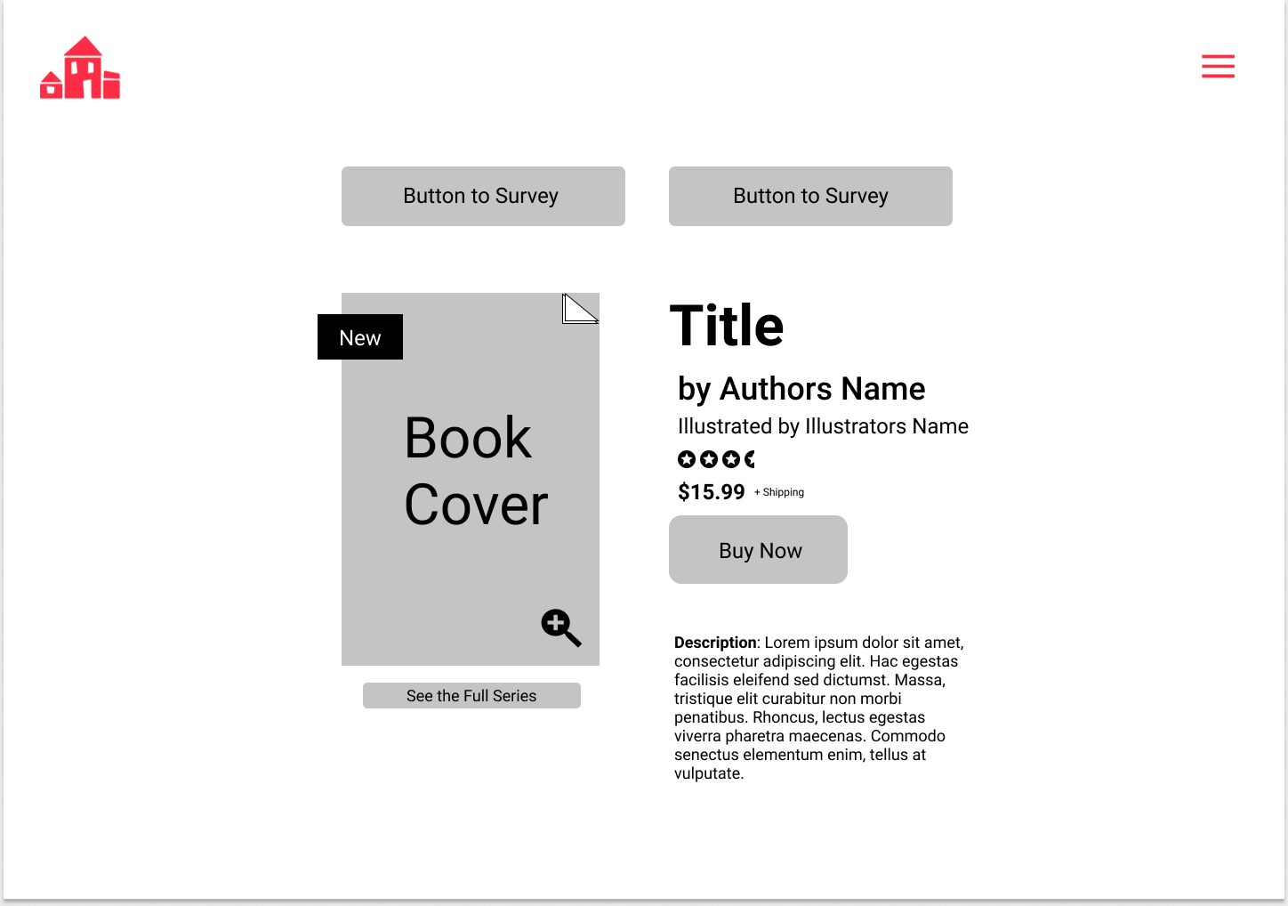
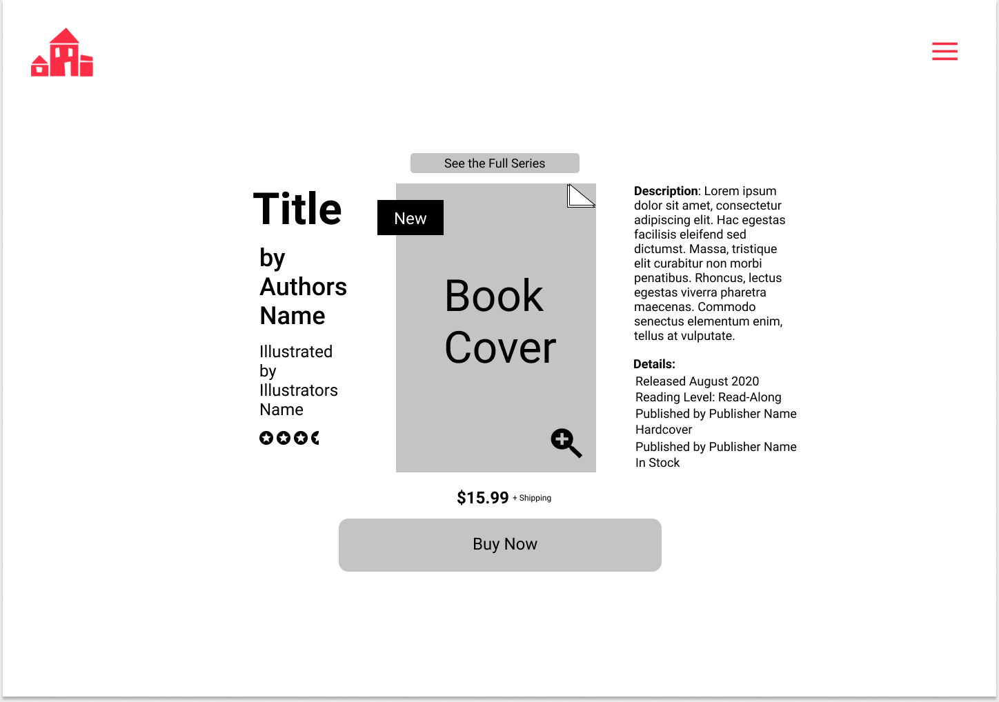
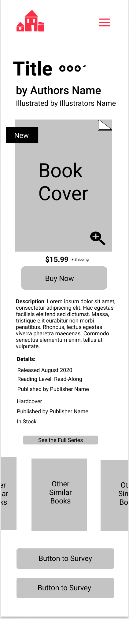
- A high definition prototype of the desktop and mobile experience were produced, delivering to the stakeholders and users a design true to their practical needs and behavioral style.
- Further iterations will be expected after future user testing and real world insight.


Marcus Dixler – Portfolio